The two types of quality
The Japanese define quality in two ways:
- atarimae hinshitsu (当たり前品質)
- miryokuteki hinshitsu (魅力的品質)
Understanding the difference between them is the key to building products that users love.
atarimae hinshitsu (当たり前品質)
Atarimae hinshitsu is the idea that things should work the way that they are supposed to.
It's a purely functional requirement and is satisfied when the product completes the job that it was designed to create. For example, an IKEA chair meets the atarimae hinshitsu quality expectation because it's made to sustain and fit a person of average height and weight. Being reliable and robust is a significant component of quality, and there is elegance in things working according to their function.

miryokuteki hinshitsu (魅力的品質)
Miryokuteki hinshitsu, on the other hand, is the idea that things should have an aesthetic quality.
It's basically the kind of quality that fascinates you. This could include things like visual appearance, sound, or anything that gives personality to a product. For example, a Herman Miller chair could be considered miryokuteki hinshitsu because it goes beyond its functional requirements. There's a distinct touch, smell, texture, and design that makes it unique; it's a “special refuge from the strains of modern living," as they say. These aspects bring added value to the product and make it desirable.

quality applied to software
As developers, we are often asked to build software products that have good quality, but what does that really mean? Is software quality only about meeting a certain number of functional requirements? What about the other parts of a software company? Let's explore how this is applied to real-world scenarios.
product that works vs. product that inspires
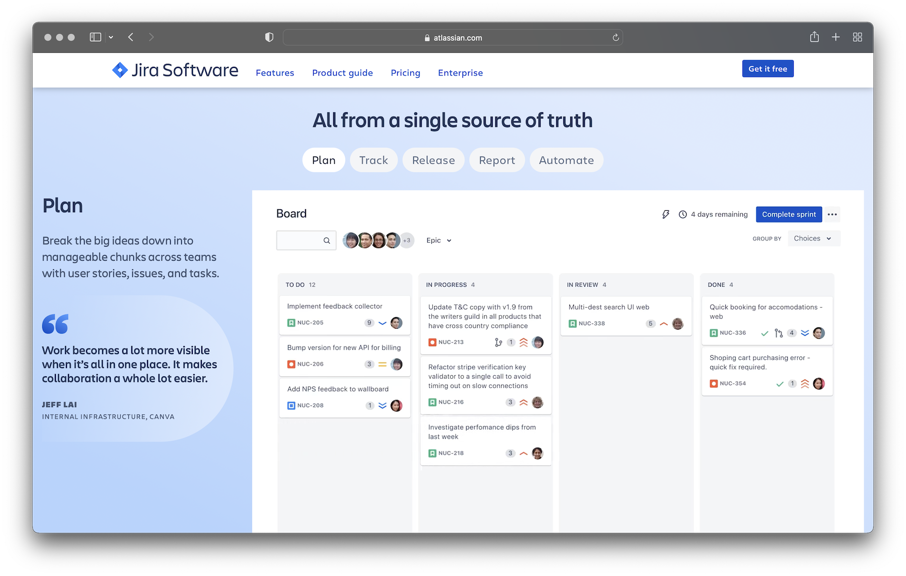
Developers may disagree on many things, but there's one thing that almost everybody will agree on — Jira sucks. The reason for that is not because Jira is slow, because the design is outdated, or "feature x" is missing. The problem is the entire product mentality. Jira introduces more process. It encourages micro-management. It disrupts flow. And any product that disrupts flow is inherently bad for users.
This doesn't mean that Jira is a failure. In fact, Jira is a massive success from a sales perspective. It's a software that serves the needs of middle management, or, at least, the needs middle management thinks it has. What are those needs? Metrics. Being able to make charts, graphs, and reports for the next-higher level of management, so they can say that their team is productive and isn't falling behind. Jira is focused on atarimae hinshitsu and nothing else.
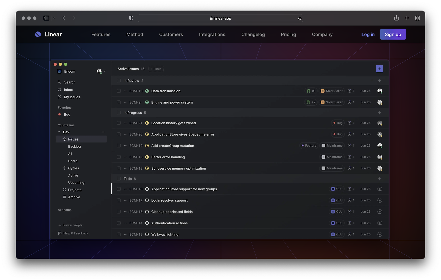
When you look at Linear, you see the complete opposite. It's modern, clean, and has all the features you need without being bloated. On top of having a traditional web app, they also built a pretty fast desktop experience. They know that developers will use the app daily and will probably spend more time on it than project managers or stakeholders who are only using it to report progress once a week. That's why they added keyboard shortcuts for almost every single interaction.
They are able to create miryokuteki hinshitsu by focusing on the user, not the buyer.
marketing that works vs. marketing that inspires
It's common for companies to change their go-to-market strategy from bottom-up to top-down model after achieving some level of success. When Braintree started, it was about serving individual developers (screenshot from 2014). Nowadays, all you see are "Contact Sales" buttons everywhere.
This approach can definitely work if you're targeting executive leaders at specific company sizes. Still, one thing is sure — developers don't want to enter your "marketing funnel," they don't want to be considered a "qualified lead," and they don't want to be "converted." All they want is to try a product without having to speak to a salesperson first.


Stripe is an overused example, but there is still a lot to learn more about them. The company was founded in 2010 and raised a total of $2.3B in funding. They serve millions of businesses, including dozens of Fortune 500 companies. And yet, even after all these years, they still haven't changed their strategy.
They continue to push the envelope when it comes to UI and UX. They continue to build elegant APIs and refined documentation. They continue to include code snippets on their landing page because they know that's what developers want to see.
They also know that developers will not download a gated PDF e-book, so they publish all these in-depth guides on their website. They know developers will not register for a special webinar, so they make all their sessions available online. There's no "lead magnet" strategy behind these initiatives, and that's what creates trust.
recruiting that works vs. recruiting that inspire
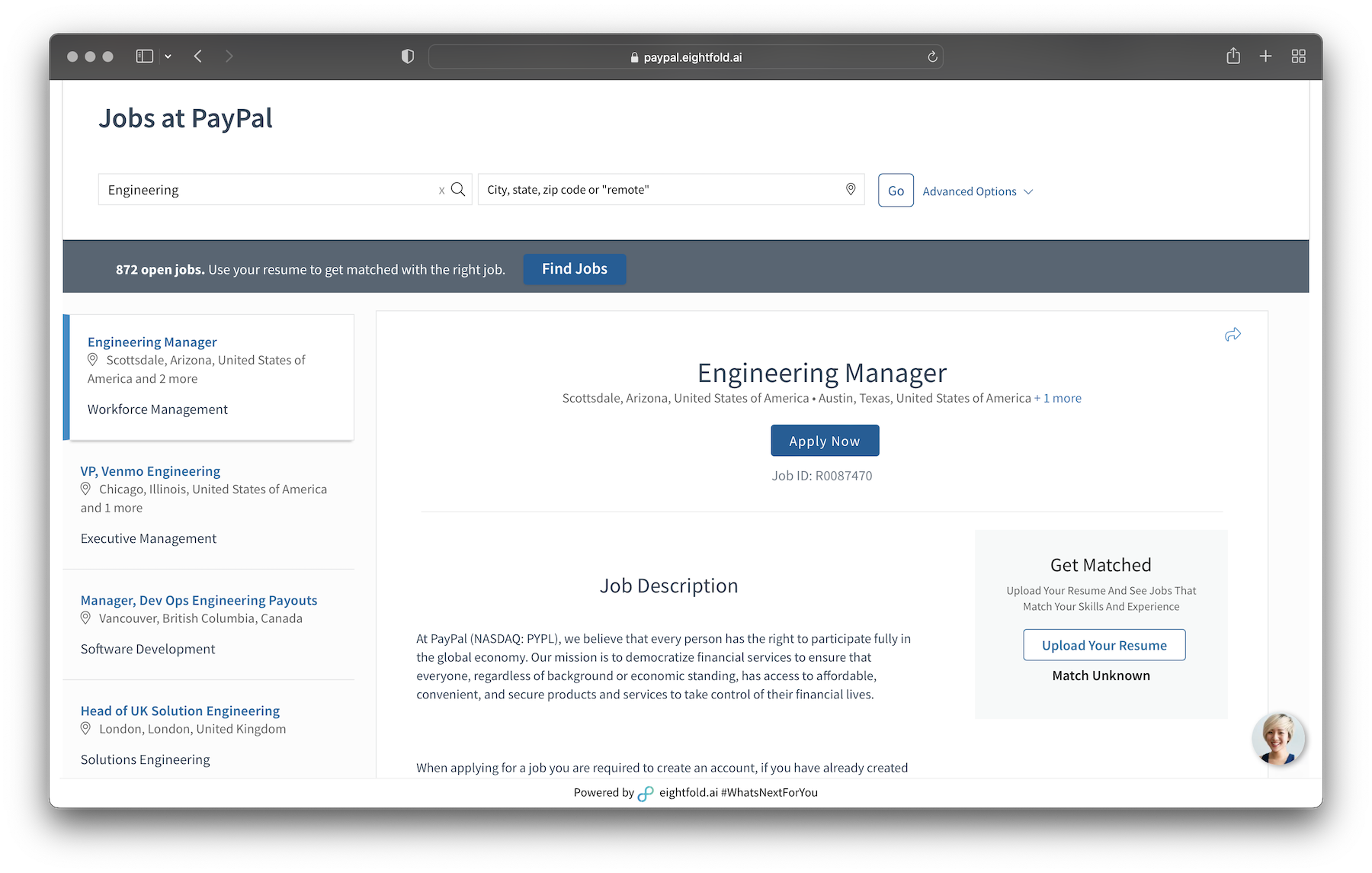
Every big corporation like PayPal has the exact same Jobs page. You see a list of open positions, filter by a department or specific region, and then read an uninspiring job description. When you finally decide to apply for a role, you receive a soulless, automated message in your email inbox. After weeks of silence, you may get a chance to speak with a recruiter. If you don't get lucky, you may get another template message saying you're not a good fit for the role.
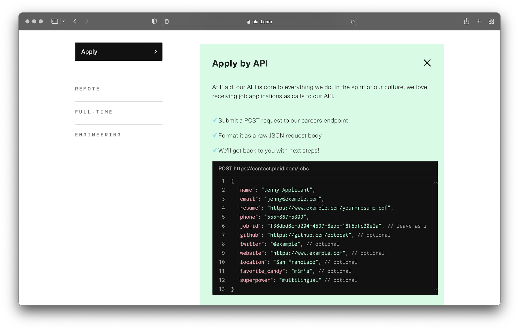
Knowing how frustrating that process can be, some startups find a creative approach to reach more candidates and cut through the noise. Plaid, for example, continues to attract great engineering talent with its unique approach to recruiting. They have an API-first product, so they lean on that narrative and showcase their culture by allowing engineers to apply by API.
engineering that works vs. engineering that inspire
Talented developers tend to gravitate towards others based on what they build. That's why announcing new features is one of the most effective ways to attract engineers and create a sense of “we’re always shipping.” Changelogs are the perfect place to explore that.
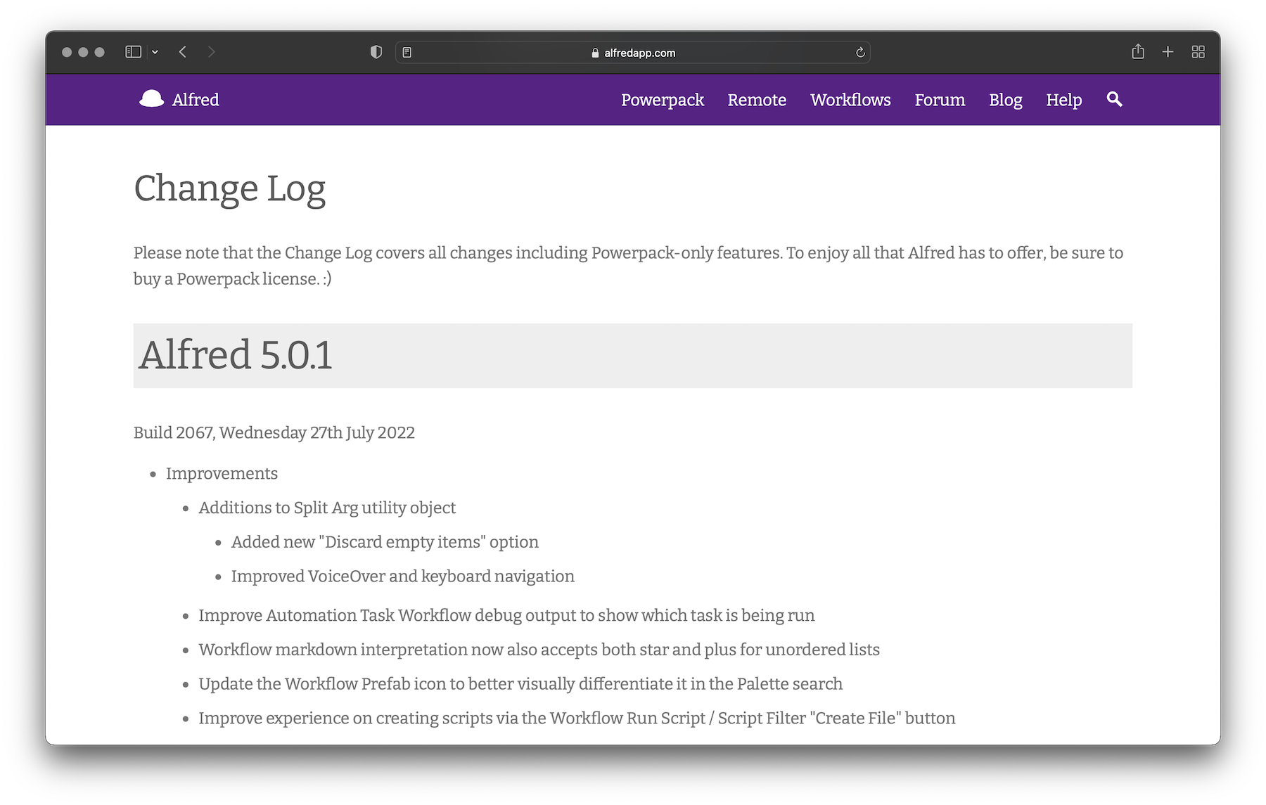
When you look at what products like Alfred are doing to communicate changes, you'll notice the same monotonous and repetitive format. There's a version, there's a date, and there are a bunch of bullet points. This format works, and the information is there, but it's not engaging and doesn't evoke any special feeling.
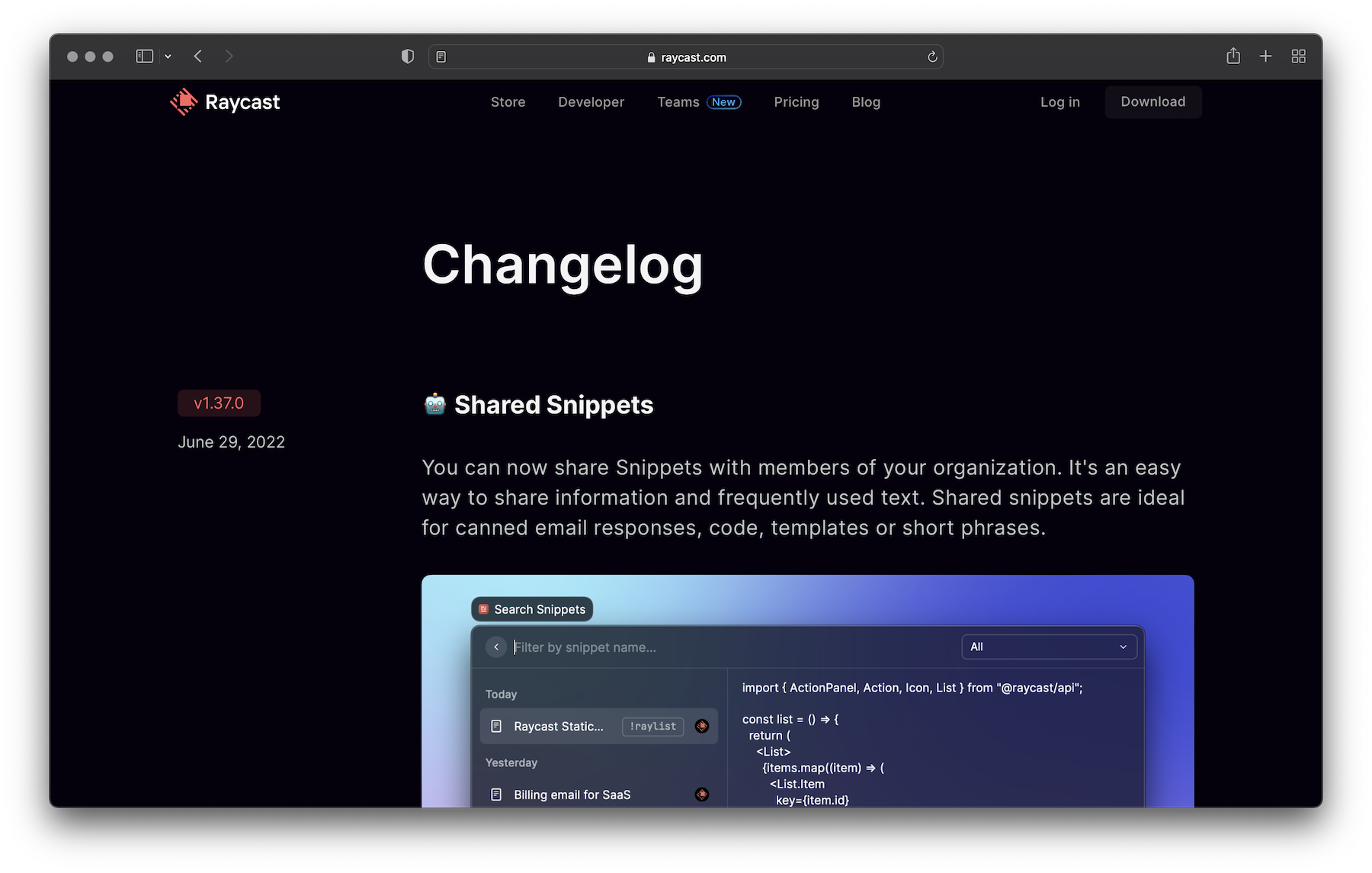
Raycast, on the other hand, is a team that not only wants to show value but also wants to create a pleasant feeling on their changelog. They describe every change in detail because they know that changelogs are made for humans, not machines. They have engaging titles and polished screenshots because they know the magic is in the details. They understand what makes a good changelog and leverage that to amuse readers and spark interest.
As with anything in life, when you invest extra time in an area typically neglected by others, you generate an element of surprise and enchant. That's what miryokuteki hinshitsu is all about.
what are you optimizing for?
Quality is not about trade-offs; quality is about philosophy. You can choose to achieve both atarimae hinshitsu and miryokuteki hinshitsu so that a product will meet users’ needs and be delightful to use.
However, when thinking about quality, it's crucial to have self-awareness. You have to look at what you are optimizing for as an individual and see if that matches with what your team is optimizing for. If there's a mismatch, there's a high chance that you'll end up with a suboptimal product.
For more on this topic, I recommend watching Jiro Dreams of Sushi, a documentary directed by David Gelb, and How to Build Products Users Love, a talk by Kevin Hale.
Special thanks to Briza Bueno, Bu Kinoshita, Carol Moreschi, Jonni Lundy, Michael Grinich, Shawn Wang, TK, Vitor Fernandes, Ygor Costa, and Zeh Fernandes for reviewing this article before it was published.
