How I built my personal website
Most people think about their personal websites as a portfolio. It's this thing where you can showcase your work and share some contact info.
For me, a personal website is much more than that - it's a playground for experimentation.
It's your own little corner of the web where you have full control. It's a place where you can break the rules and build anything you want. There's no deadline, no predefined stack, no boundaries.
Over the years, I kept evolving and improving this space. Today, I want to take you on a trip through all the different versions and technologies used here, along with details on how I built this latest iteration.
Version 1 (2011 - 2012)
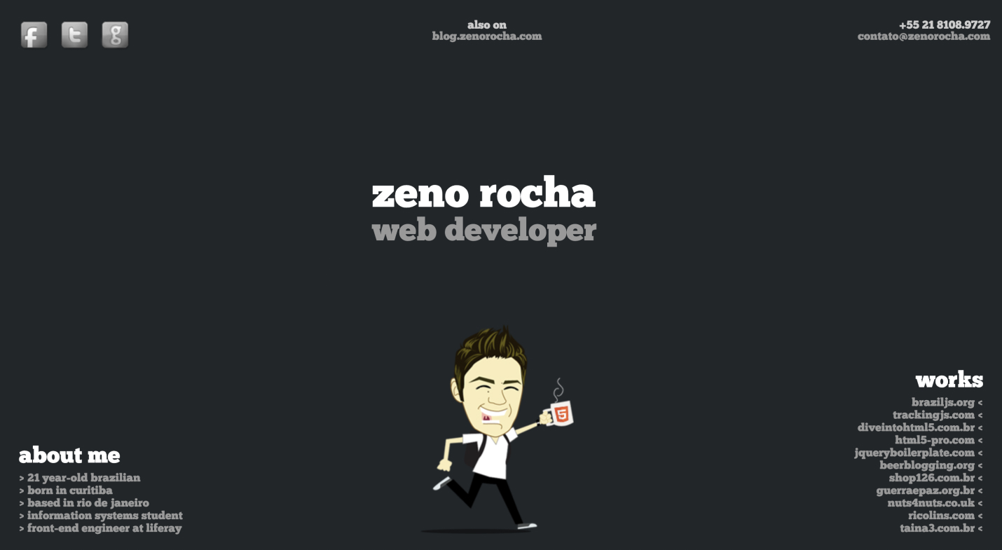
This website was written in plain HTML and CSS. There was no build process, compilation, or anything like that. The only automated step was a shell script that would use rsync to send all the files via SSH to my Dreamhost server.
I wanted to try some fancy JavaScript techniques, so I had some data stored as JSON and loaded it on the client-side using Ajax. The transitions were implemented using jQuery, and the markup was written with HTML5, so I had to use Modernizr to support IE6.
What I loved about this site was the simplicity. There was no navigation, only external links. On a single page, you could see everything. Also, that illustration was so fun!

Version 2 (2013 - 2015)
Apart from this site, I also had a blog that was hosted on Tumblr and that was served with the blog.zenorocha.com domain.
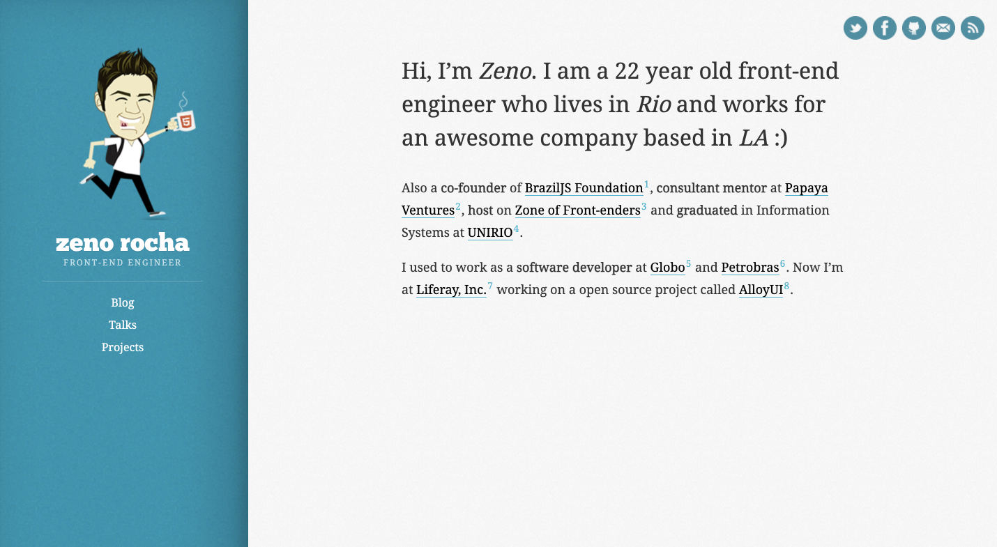
Once I started writing more posts, I felt the need to unify my portfolio with my blog. That's when I started using Jekyll. This was my first exposure to Ruby and YAML, which was really exciting. The posts were written in Markdown. The layout was built using the Liquid templating language.
I remember using this JavaScript library called Fokus to impress people when they selected a paragraph. To automate the linting process, I used a task runner called Grunt. For hosting, I used GitHub Pages which was giving HTTPS certificates for free (that was a big deal back then).

Version 3 (2016 - 2020)
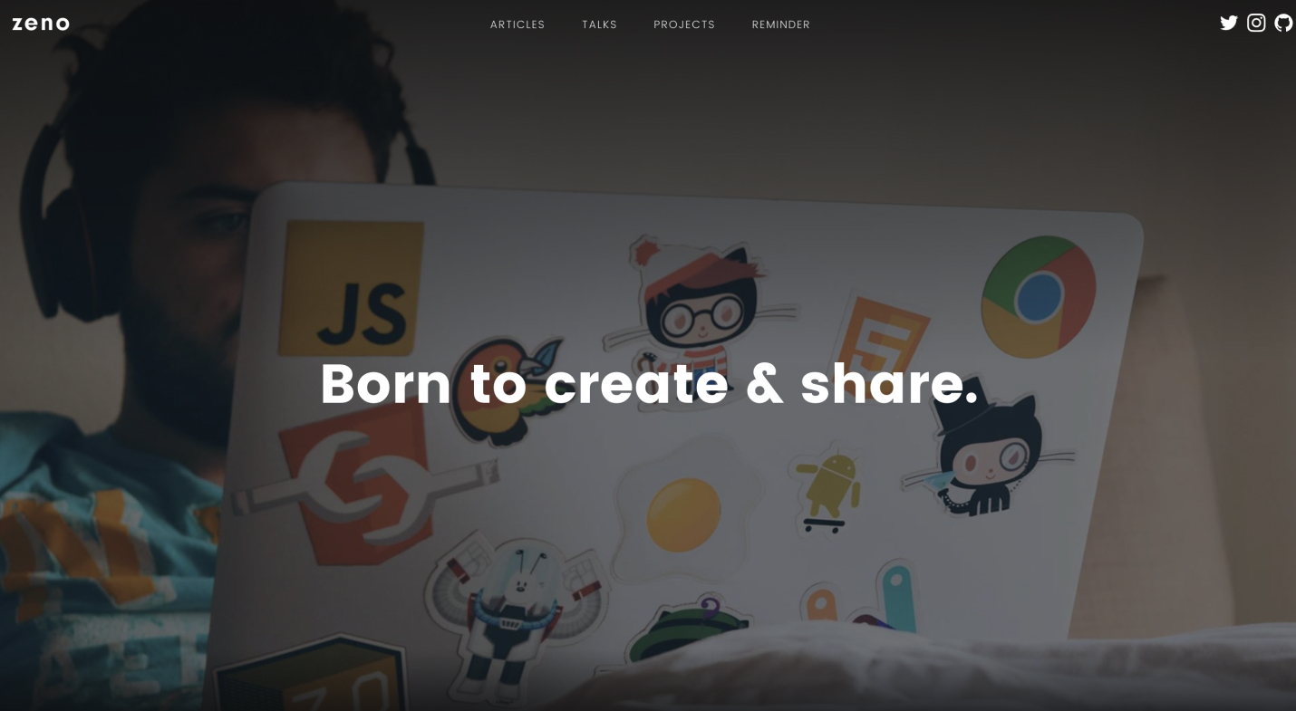
After having so many problems with Ruby gems, I ended up migrating to Metalsmith, a super fast and pluggable static generator written in JavaScript. The templating language I chose was Handlebars, and the whole thing would compile in seconds.
On the client-side, I used Headroom, a fancy library that slides the header out of view when scrolling down and slides back in when scrolling up. At that time, Single Page Applications (SPAs) were a huge trend, so I used Senna.js, a library that I helped build, to accomplish it.
I'm super into dogfooding, so I also used a cloud hosting solution that I was building at work called WeDeploy, which eventually became Liferay DXP Cloud.
In terms of design, a huge inspiration for me was Medium. The reading experience and the way images were displayed were extremely beautiful, so I tried to replicate some of that.

Version 4 (2021 - Present)
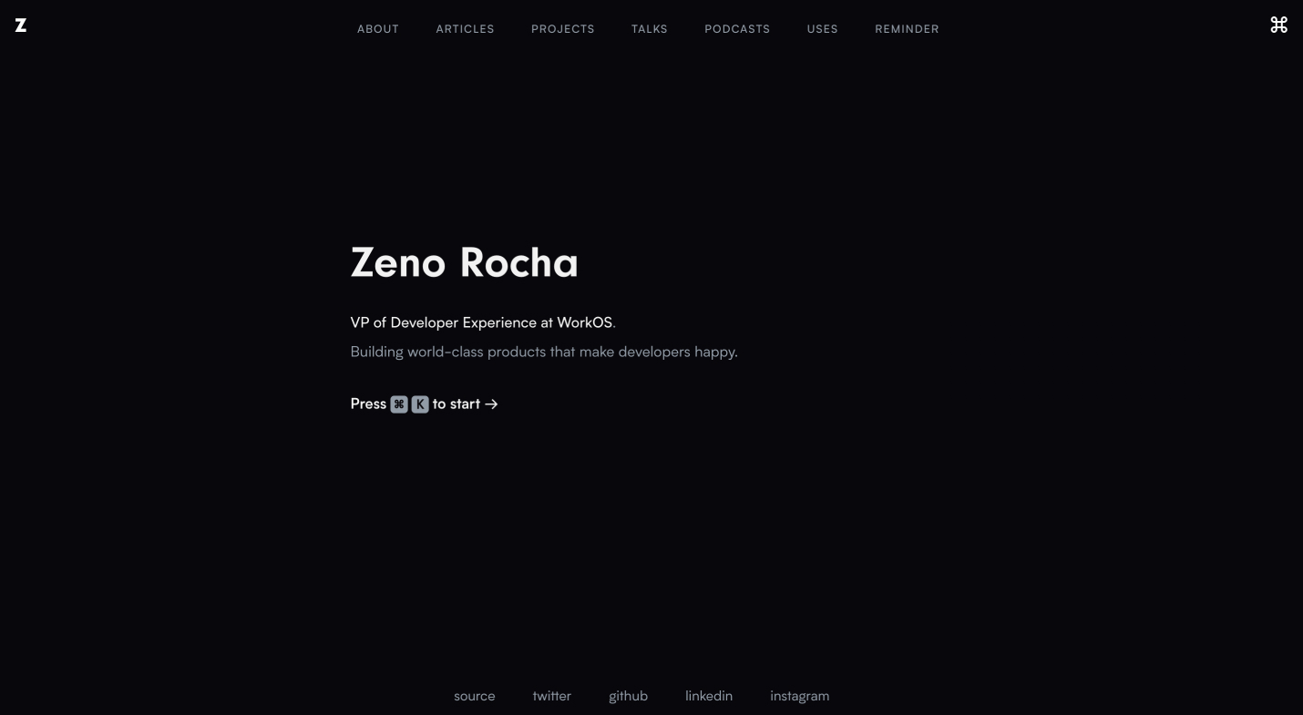
For this new site, I tried to focus on typography instead of images, mixing solid dark tones with vivid gradients. It features two fascinating concepts - keyboard shortcuts and command palettes.
The UI components are written in React, and everything is powered by Next.js. The cool thing about this stack is that you can make everything static compiled while still adding some dynamic aspects like fetching the Google Analytics API to display the number of views. Deployment is handled by Vercel, the single best developer experience you can find nowadays.
The command palette is built using kbar. The code snippets are highlighted with Prism using a custom set of Dracula colors. The favicons are made with SVG and support both dark and light modes. Finally, all the smooth hover interactions are powered by Framer Motion which I'm absolutely in love with.

The end?
Is this site perfect? No. Is this site done? Not at all.
This is a snapshot of my personality, my worldview, and the limited time I found to display it. There are good things about it, but there are also fundamental flaws. Having this permanent playground means that there is always opportunity to improve.
And that's the beauty of it.